The 7 Website Personalities: Find the Perfect Match for Your Business
by James Brace, Owner and Operator
When someone lands on your website, they form an impression in seconds—often before they've read a single word. That first impression is shaped not just by what you say, but by how your site looks and feels.
Just like people, websites have personalities. Some are elegant, others are bold, while some are playful and fun. Choosing the right "personality" for your website is key to connecting with your audience and expressing your brand's unique identity.
In this post, I'll walk you through seven distinct website personalities so you can discover which style best fits your business. Whether you're building a new site or refreshing an old one, understanding these personalities will help you make design choices that truly resonate with your visitors.
Each of these website personalities brings its own unique strengths and character. Let's explore what sets them apart—starting with the first style on our list.
Table of Contents
- 1. The Serious and Elegant Website
- 2. Minimal and Simple
- 3. Plain and Neutral
- 4. Bold and Confident
- 5. Calm and Peaceful
- 6. Startup and Upbeat
- 7. Playful and Fun
- Conclusion
1. The Serious and Elegant Website
Websites with a serious and elegant personality exude sophistication and exclusivity. This style is all about making a strong, refined impression—think of the feeling you get when you walk into a high-end jewelry store or a luxury real estate office. The design relies on classic serif typefaces, often with delicate, light weights and smaller body text, to create a sense of timelessness and trust.
Color palettes are rich and understated: gold accents, deep blues, blacks, and soft pastels set the tone for luxury. Large, high-quality images are front and center, showcasing products or properties in their best light. Layouts are often creative and experimental, breaking away from rigid grids to add a sense of uniqueness and artistry.
Icons are rare, but when used, they're thin and minimal—never distracting from the overall elegance. You won't find drop shadows or rounded corners here; everything is crisp, clean, and intentional.
Industries: Real estate, high fashion, jewelry, luxury products or services
Serious and Elegant Examples:
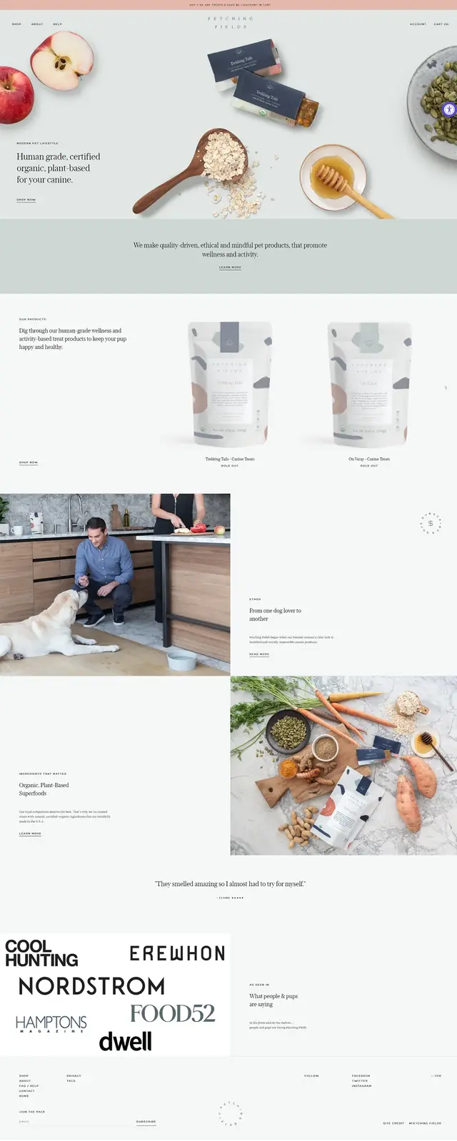
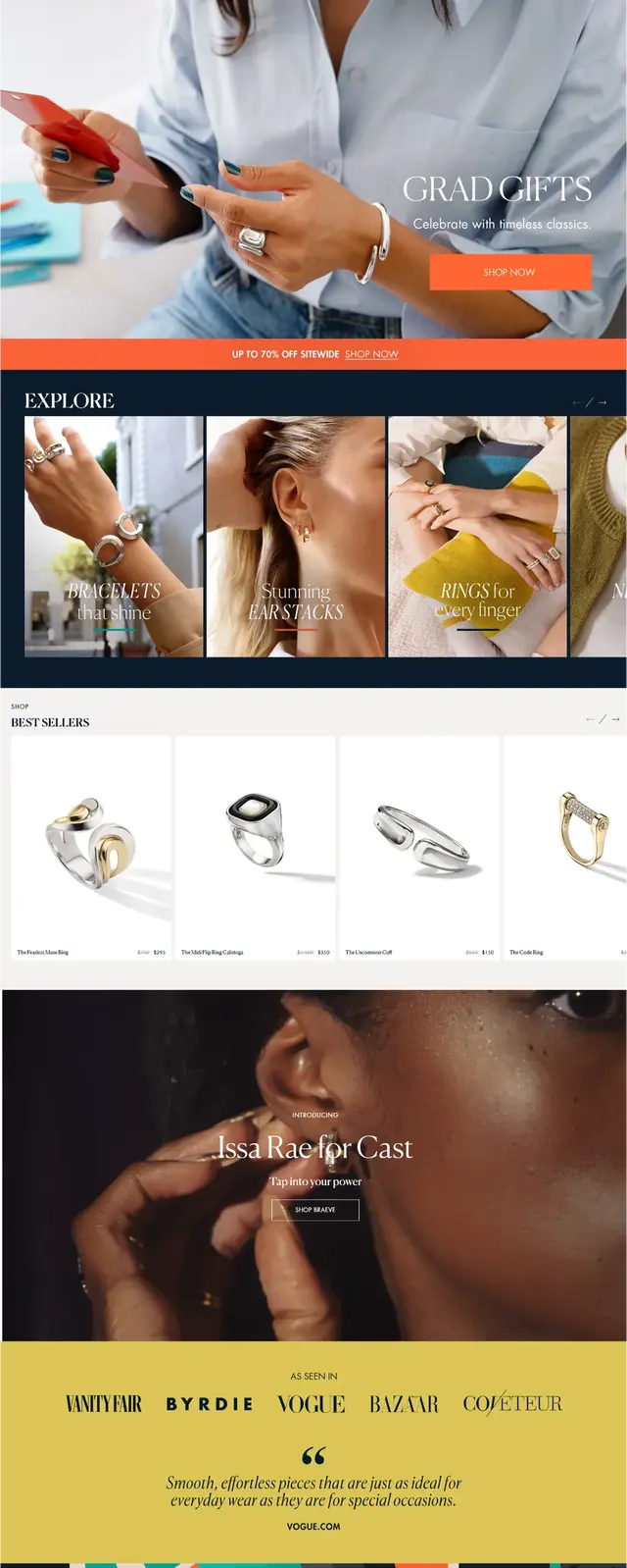
The websites for fetchingfields.com and castjewelry.com both showcase the serious and elegant personality, using understated design, elegant fonts, and a focus on quality visuals to convey sophistication and trust.
2. Minimal and Simple
Minimal and simple websites are the digital equivalent of a perfectly organized, clutter-free workspace. These sites are designed to let content breathe, using lots of white space and a restrained color palette—usually just black or dark grey on a pure white background, with maybe a single accent color.
Typography is modern and unembellished, with boxy or squared sans-serif fonts and small body text. Images are used sparingly, often to add a pop of color or visual interest, but illustrations are rare and, if present, strictly black and white.
Layouts are straightforward, often a single narrow column that guides the reader's eye down the page. The absence of icons, shadows, and rounded corners keeps the focus on clarity and simplicity. This style is perfect for brands that want to communicate efficiency, modernity, and a no-nonsense approach.
Industries: Fashion, portfolios, minimalism companies, software startups
Minimal and Simple Examples:
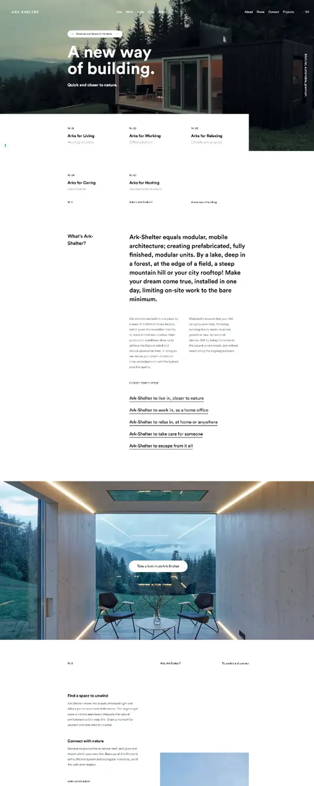
ark-shelter.com and srotimi.design exemplify the minimal and simple website style, using clean layouts, restrained color palettes, and plenty of white space to let their content stand out.
3. Plain and Neutral
Plain and neutral websites are designed to be unobtrusive, letting the content or product take center stage without any design distractions. This style is common among well-established corporations and organizations that value reliability and professionalism over visual flair.
Typography is neutral and functional, with small sans-serif fonts that don't draw attention to themselves. The color palette is safe and familiar—think blues, blacks, and other muted tones that convey stability. Images are present but typically small, supporting the content rather than dominating it.
The layout is structured and condensed, with lots of boxes and rows to organize information efficiently. Icons, if used, are simple and understated. There are no shadows or rounded corners, reinforcing the straightforward, businesslike feel.
Industries: Well-established corporations, companies that don't want to make an impact through design
Plain and Neutral Examples:
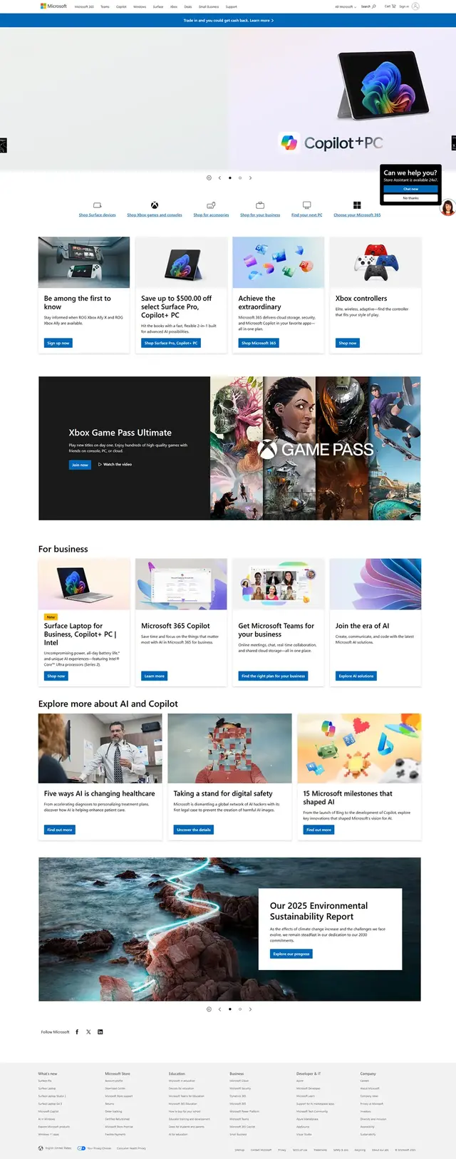
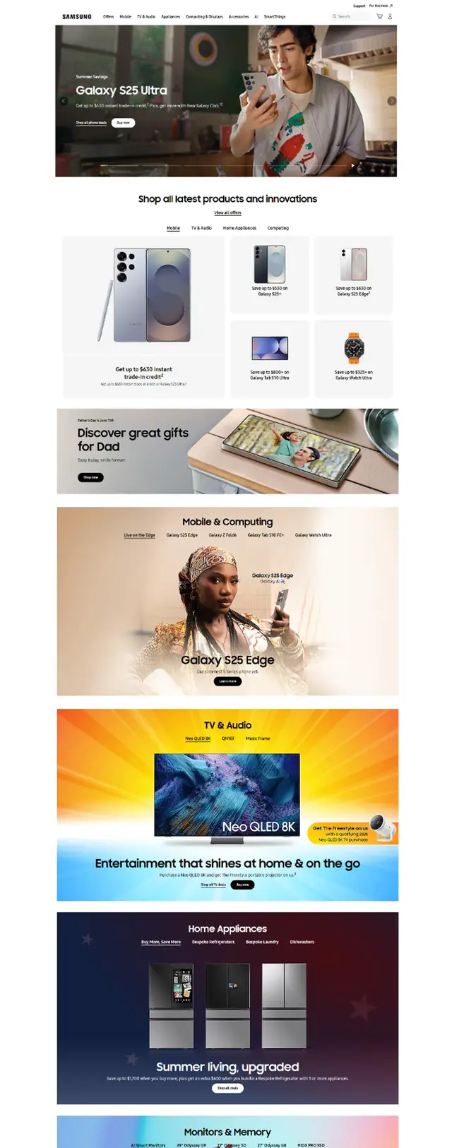
microsoft.com and samsung.com each demonstrate the plain and neutral website personality—microsoft.com with its familiar blue accents and straightforward navigation, and samsung.com with its clean boxes and balanced use of imagery..
4. Bold and Confident
Bold and confident websites are all about grabbing attention and making a statement. These designs use bright, energetic color palettes and large, impactful typography—often with uppercase headings—to create a sense of excitement and authority.
You'll see big color blocks and sections that guide the visitor's eye, along with plenty of large, striking images. The layout can be anything from highly structured to wildly experimental, but the goal is always to stand out and leave a memorable impression.
Icons, shadows, and rounded corners are usually absent, keeping the focus on the boldness of the colors and type. This style is perfect for digital agencies, startups, and brands that want to project strength, innovation, and confidence.
Industries: Digital agencies, software startups, travel, "strong" companies
Bold and Confident Examples:


onlyorca.com and callmelord.com exemplify the bold and confident website style, using vibrant color blocks, strong typography, and dynamic layouts to make a memorable impact.
5. Calm and Peaceful
Calm and peaceful websites create a sense of relaxation and trust, making them ideal for healthcare providers and wellness brands. The design uses soft serif or gentle sans-serif typefaces, paired with pastel or washed-out colors like light oranges, greens, and blues.
Images and illustrations are chosen to match the soothing color palette, often featuring nature, wellness, or gentle abstract shapes. Layouts vary, but the overall effect is always tranquil and inviting.
Icons are used frequently to guide users gently through the site, and you'll often see elements with rounded corners and the occasional soft shadow to add depth without harshness. This style helps visitors feel at ease and cared for from the moment they arrive.
Industries: Healthcare, products focused on consumer well-being
Calm and Peaceful Examples:


Both calm.com and rosebud.com are examples of calm and peaceful website personalities, each using soft color palettes to create a welcoming atmosphere.
6. Startup and Upbeat
Startup and upbeat websites are energetic, modern, and full of life. These sites use medium-sized sans-serif headings and light text colors, often set against light gray backgrounds or subtle gradients. Blues, greens, and purples are popular choices, giving the design a fresh, forward-thinking vibe.
Images and illustrations are always present—3D graphics and playful patterns are especially trendy. Layouts are creative and experimental, reflecting the innovative spirit of the companies they represent.
Icons are frequent, and you'll notice subtle shadows and glows that add a sense of depth and interactivity. Rounded corners are common, softening the look and making the site feel approachable and friendly. This style is perfect for startups and tech companies that want to appear dynamic and approachable.
Industries: Software startups, modern-looking companies
Startup and Upbeat Examples:


grammarly.com and sanity.io exemplify the startup and upbeat website style, using modern layouts, vibrant accents, and engaging visuals to convey innovation and energy.
7. Playful and Fun
Playful and fun websites are bursting with personality and creativity. These designs use round, creative typefaces—sometimes even handwritten—and aren't afraid to center text or break the rules for a more whimsical feel.
Color is everywhere: backgrounds, text, and images all contribute to a lively, energetic atmosphere. Hand-drawn or 3D illustrations, geometric shapes, and patterns are common, making the site feel interactive and engaging.
Icons are frequent and often match the hand-drawn or playful style. Subtle shadows and generous border-radius add to the soft, friendly vibe. This style is perfect for brands targeting children, pet owners, or anyone who wants to make their website a joyful experience.
Industries: Child products, animal products, food
Playful and Fun Examples:


clay.com and cobfoods.com exemplify the playful and fun website style, using bright colors, creative typography, and lively illustrations to create an engaging and energetic experience.
Conclusion
Choosing the right website personality isn't just about looks—it's about making sure your online presence truly reflects your brand and connects with your audience. As you've seen, each personality brings its own strengths and unique appeal. Take a moment to think about which style best matches your business values, your customers, and the impression you want to leave.
If you're unsure which direction to take, or if you'd like expert guidance in bringing your website's personality to life, I'm here to help. Contact me for a free consultation—together, we'll find the perfect match for your brand and create a website that stands out for all the right reasons.